This past weekend I managed to get in a lot of painting and knock out a unit of 10 Bloodletters. First up some shots, which aren’t very good. I’ll get better quality ones later when I have time to set up my light box and everything. They do also look better in person. These shots are washing them out. I just wanted to get some quick shots up while they were still on my painting table.
Gallery
Painting Thoughts
With time being important, I have to get these done for a tournament, and coupled with the fact they are a troop choice, I painted them to a different standard. I’ve always painted my troop choices with easier techniques for speed. An HQ or an elite I’ll spend more time on because of their status and you generally need less of them so you aren’t spending hours on one model when you need 10.
Anyway, these guys got base coated in Khorne Red, washed with Baal Red then Devlan Mud and then a light dry brushing with Blood Red. They’re darker than most do for Bloodletters but I like it.
Oh, the swords I did spend some time on. I figured if I was doing such a simple scheme on most of the model that I should have some standout feature. It’s often my trick with simple paint methods like this, find one feature that will really make the model stand out. It tends to draw you away from the simple techniques.
The swords I did some simple wet blending on. I based coated them in white then washed in yellow and then orange around the outside. It’s not perfect but it’s a technique I can definitely refine and use again.
With these out of the way I just need to get 5 Havocs completed and a few odds and ends, like a power fist (magnetized arm), and things like that. Oh, and the arm for the model you may have noticed above missing one, oops. So far I’m making good time though.
- Creative Twilight’s Future and My Thoughts (Feedback Welcomed!) - December 4, 2021
- My Top Gift Ideas for Miniature Painters & Hobbyists + Gifts to Avoid - December 2, 2021
- The Year That Was 2020 and Where I’ve Been - January 17, 2021
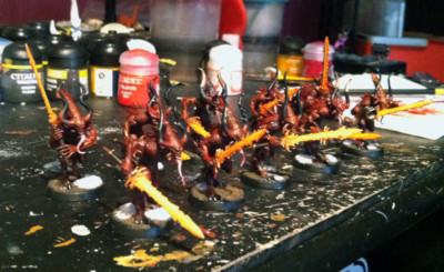
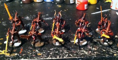
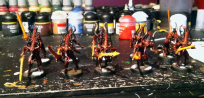

These look good as a unit. I like the way the swords draw focus. It matches the last Daemon Prince you posted in that respect. It also gives me the impression that they are pouring all of their rage and hatred into their weapons as they focus their entire being on making the next kill.
I do like my glowy attention grabbing swords.
These look very nice. Simple, but effective with enough contrast to make them interesting and stand out on the table.
Thanks.
With the thought of having to do a bunch more of these I wanted something simple. Not every model/unit is made out to be a masterpiece.
Looks good! Do you have the arm? I can look again to see if I have one. Do you have any Spawn yet in case a Boon roll goes bad/good?
You gave me the arm when you brought in the Soulgrinder bits. I just have to magnetize it.
I’m having a hard time making out the details in the pictures, but the color scheme is good. Couple of questions:
1) What (if anything) are you doing for squad markings on your demons? (my personal favorite so far is Rushputin’s blood markings: http://www.warpstonepile.com/2010/08/games-day-2010-golden-daemon.html)
2) I can’t make out from the details, but did you fill in the gaps in the foreheads of these models?
3) Have you tried opening your image files from a mobile device (particularly an iphone)? I read your blog as part of my morning routine, but can’t ever see the pics because of how they format on my device.
I’ve just marked the back of their base. Odds are if I do another unit that I’ll distinguish them a bit, maybe different colored horns or something as well as the base identifier.
I did not fill in their heads. I got them primed from Hippie and didn’t notice the head gap until I had things base coated, at which point I said fuck it.
The popup method I use for images on the blog is a bitch on mobile devices. I’ll have to see about resorting to the standard WP method for images on mobile.
Are you using my mobile theme? Not that it matters for the images now but will when I get around to it.
I use whatever default theme opens up when I view the site on my phone. Presumably that’s what you’re calling the “mobile theme,” though as the site is missing the top navigation bar almost completely.
I’m not sure what you’re paying in hosting fees annually, but Squarespace is supposed to have great mobile integration. Might be something to look into.
The top nav is there. Top right when viewing the mobile theme, button that says menu.
I really haven’t looked into 3rd party mobile integrations. The theme I use now is a plugin for WordPress and I’m pretty impressed with it overall. It’s not perfect but it is free :)