Whether you’re trying to paint a power sword for Warhammer 40K, or a magical weapon for D&D the approach is really the same.
I’ll show you how to paint a cool, energy/magical looking weapon that will work on any type of blade, be it sword, axe, halberd, etc. This isn’t a hard technique to learn but it does take a little time, patience, and practice.
Painting a Power Sword
I have previously done a tutorial similar to this for an energy looking sword I was painting. That weapon was different in that it had swirling energy molded onto the weapon. The approach was different, but just in case you’re after something like that.
Disclosure: Some of the links below are affiliate links, meaning, at no additional cost to you, I will earn a commission if you click through and make a purchase. The commission earned helps maintain this site.
Anyway, for this I’ll be using 4 paints for the power sword:
- White Scar (Citadel)
- Livery Green (Vallejo)
- Goblin Green (Vallejo)
- Sick Green (Vallejo)
Now, you can use any colors you like, I just really enjoy the result of using those greens. Ultimately I’m teaching you the process so you can do this with any colors you like afterwards.
I will say that this tutorial is done with blending. I do explain the process as I walk you through the painting below in the video, but if you’re looking for a more in depth understanding of blending then check out my tutorial on it. It’s covered more thoroughly there than it will be here.
Power Sword Video Tutorial
I did shoot a video for this as well if you prefer to get your tutorials in video format. Sometimes it’s easier to watch someone do it, especially when dealing with painting techniques, than it is to read and look at images.
This came out way longer than I thought too at 28 minutes, FYI. If you’re looking for the quick overview then skip the video ;)
How to Paint a Power Sword
Time needed: 20 minutes
Here’s the walkthrough on painting the power sword.
- Lay Down the Mid-tone
Since the power weapon is primed in black, I need to lay down a base coat of Goblin Green, which is my mid-tone color. This will let me work the brighter colors easier.

I always like to start off with my mid-tone color because when I’m doing something like this where I’m creating a long gradient, I can better gauge the middle when I start blending. - Start Getting Bright
Using the Livery green, I added a thin layer towards the tip on the bottom side and then near the bottom on the other. What I’m doing is reversing the gradients to give a cool look once it’s all done. You’ll see.
It’s pretty subtle, which is perfect. You know you’re doing blending right when you barely see paint on your brush and it barely shows up when you apply it. - Add More Layers to Brighten
From here I added a few more layers of the Livery Green to the power sword to smooth things out and enhance the strength of the color. I wanted to build up to the full strength of the color with a few thin layers.
I think that was roughly 5-6 thin layers.
It does take a bit more time to work the brighter colors when blending. It’s much easier to blend something darker than lighter, and this Livery Green isn’t the easiest color to blend with. It’s not the worst I’ve used though. - Make it Shine!
To really make things bright I wanted to add some white over the Livery Green on the power sword. I did a very thin layer to start with as white can be very difficult to blend.
You can barely see the white near the tip and base, which again is what I’m after. For really smooth transitions you need paint so thin that it barely shows up.
If blending is new to you then here’s a tip that will really help you out. You want to start your brush in the area that needs the least paint and move the brush to the area that needs the most.
Where you start your brush will deposit the least amount of paint. That’s why I start it on a color I need to blend out and pull it towards the other end where I need more of that color. - Layer Until You’re Happy
I did a second layer of white and got exactly what I wanted.
I wasn’t trying to blend into a pure white, just oversaturate that Livery Green a bit to really pull focus.
That white will also blend in with some edge highlights that gets done very last. - Blending it Out
From here I needed to start blending things darker, working the other end of the blade.
To start with, I needed to blend that Livery Green out some into the Goblin Green (mid-tone) on the power sword. So, I got a thin amount of Goblin Green on my brush and started blending things out.
I did this a few times until I was happy. - The Darkest Color
There was one more color I had to add, Sick Green. It’s not a real dark green, but where my brightest color is white I don’t need a very dark green for maximum contrast.
- Blend Some More
As usual, I added another layer of Sick Green to keep smoothing out the blends.
At this point I felt I had to go back to Goblin Green to smooth out the Sick Green transition, especially that bottom edge of the power sword.
This is the thing with blending, you are always going back and forth until you’re happy with a transition. Rarely do you nail something the first time. Well, rarely do I anyway ;) - A Bit More Blending
Now, from here I did smooth out a few more of those transitions. I didn’t get shots of the power sword as it would have be an endless stream of pictures that barely changed one shot to the next.
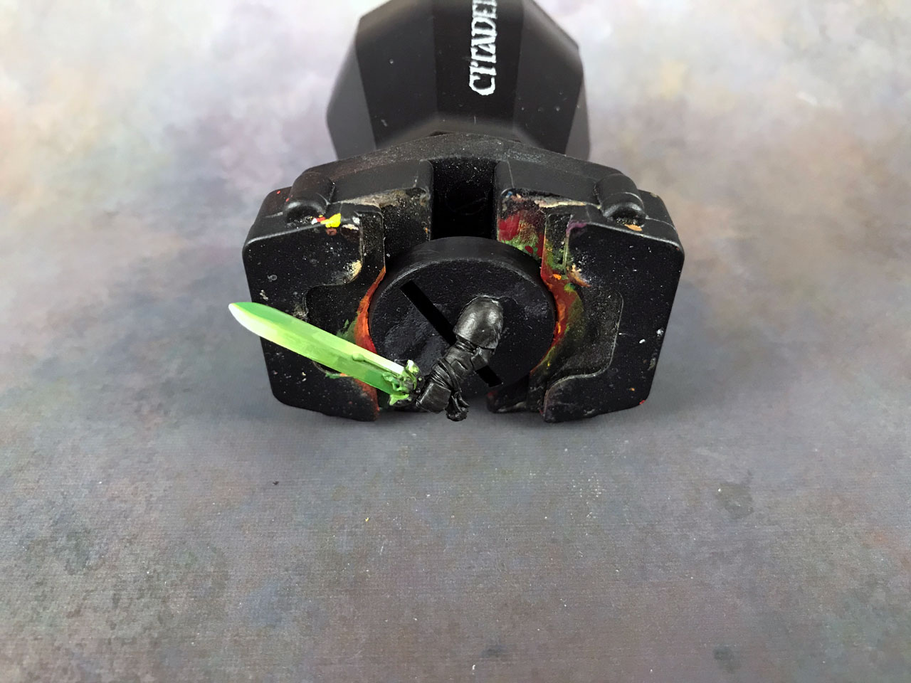
However, it was just doing more of what I’ve shown, using thin layers to smooth out blends. You’ll see the result below with the final step. - Edge Highlighting – The Final Touch
The final step I did was to edge highlight the power sword with white. I used a thin layer of white so that it blended in instead of being quite so stark. It’s still bright, which was the idea, but not quite a pure white.
The reason I did this was to create a separation on both sides of the blade. You could skip this step if you like, I have in the past, but I find it brings everything together nicely.
This white edge highlight may not be realistic, if that’s a thing with power weapons or magical weapons, but it creates visual interest and looks cool.
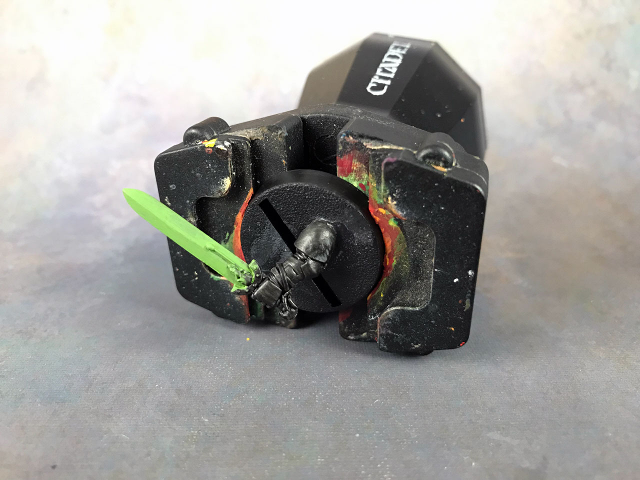
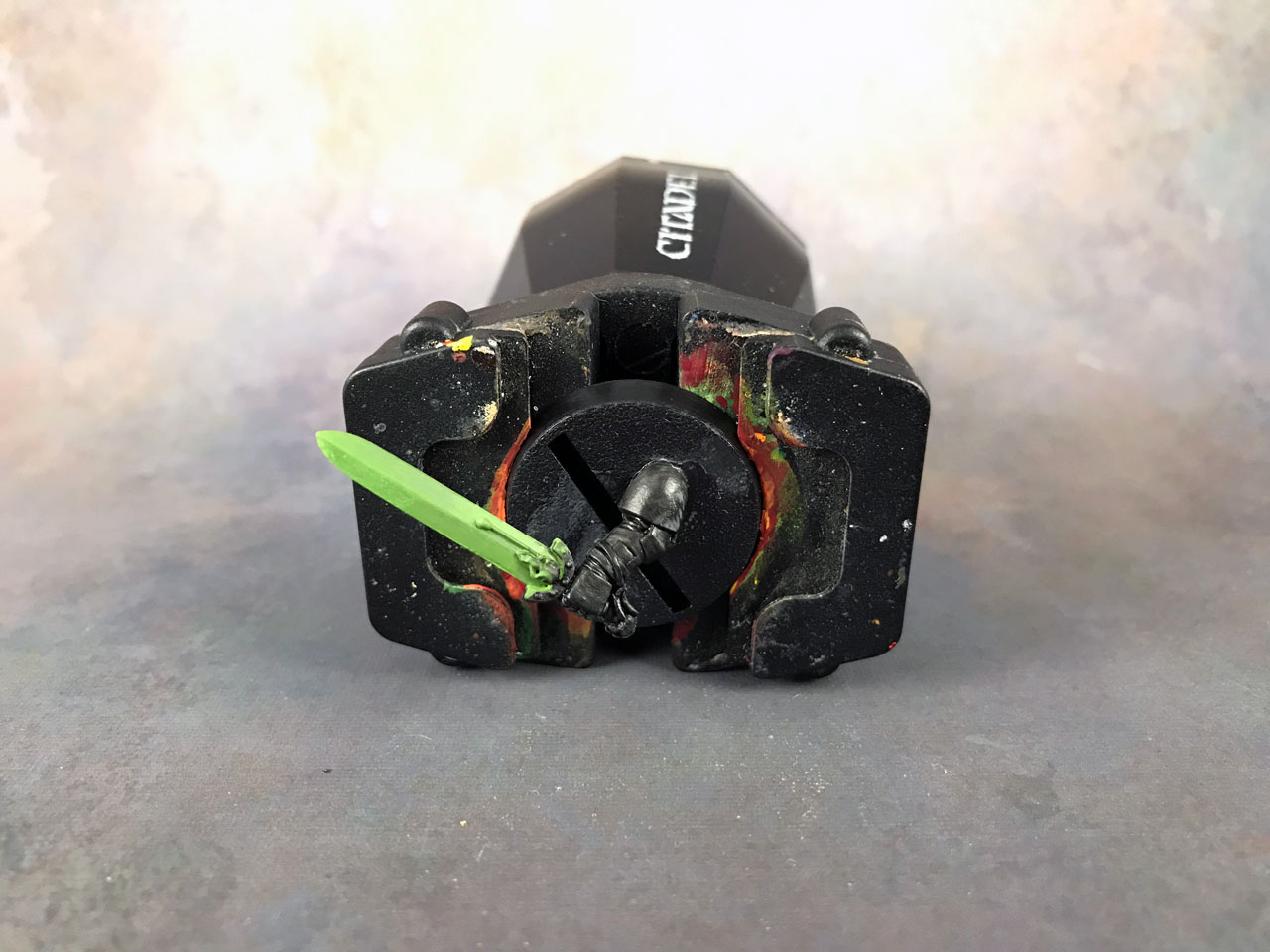
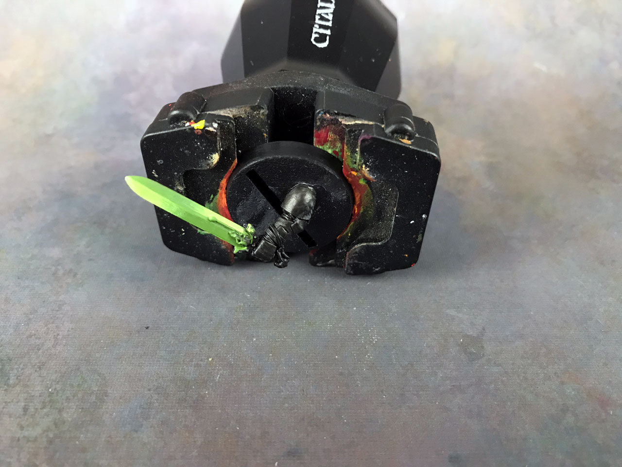
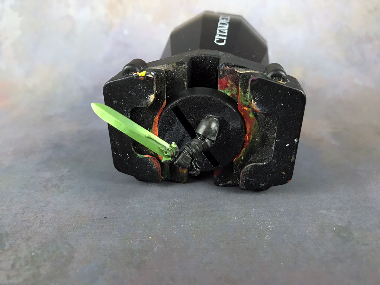
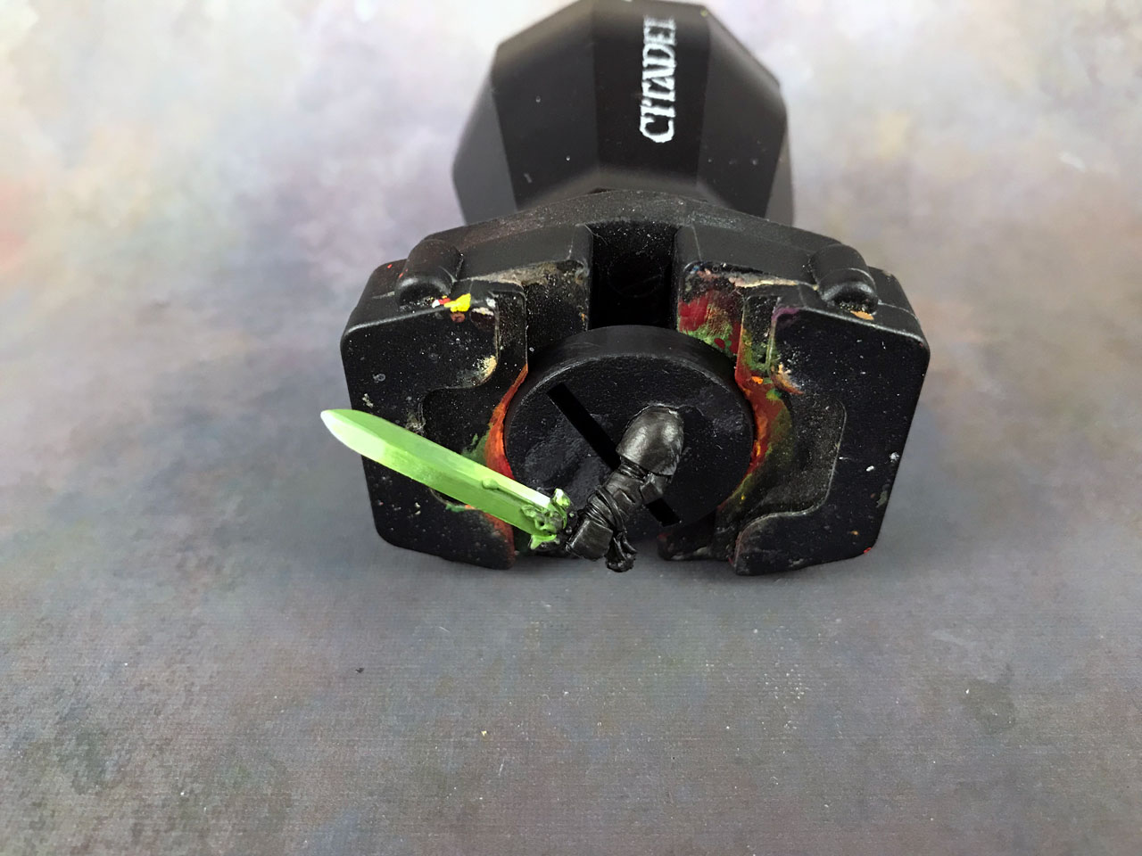
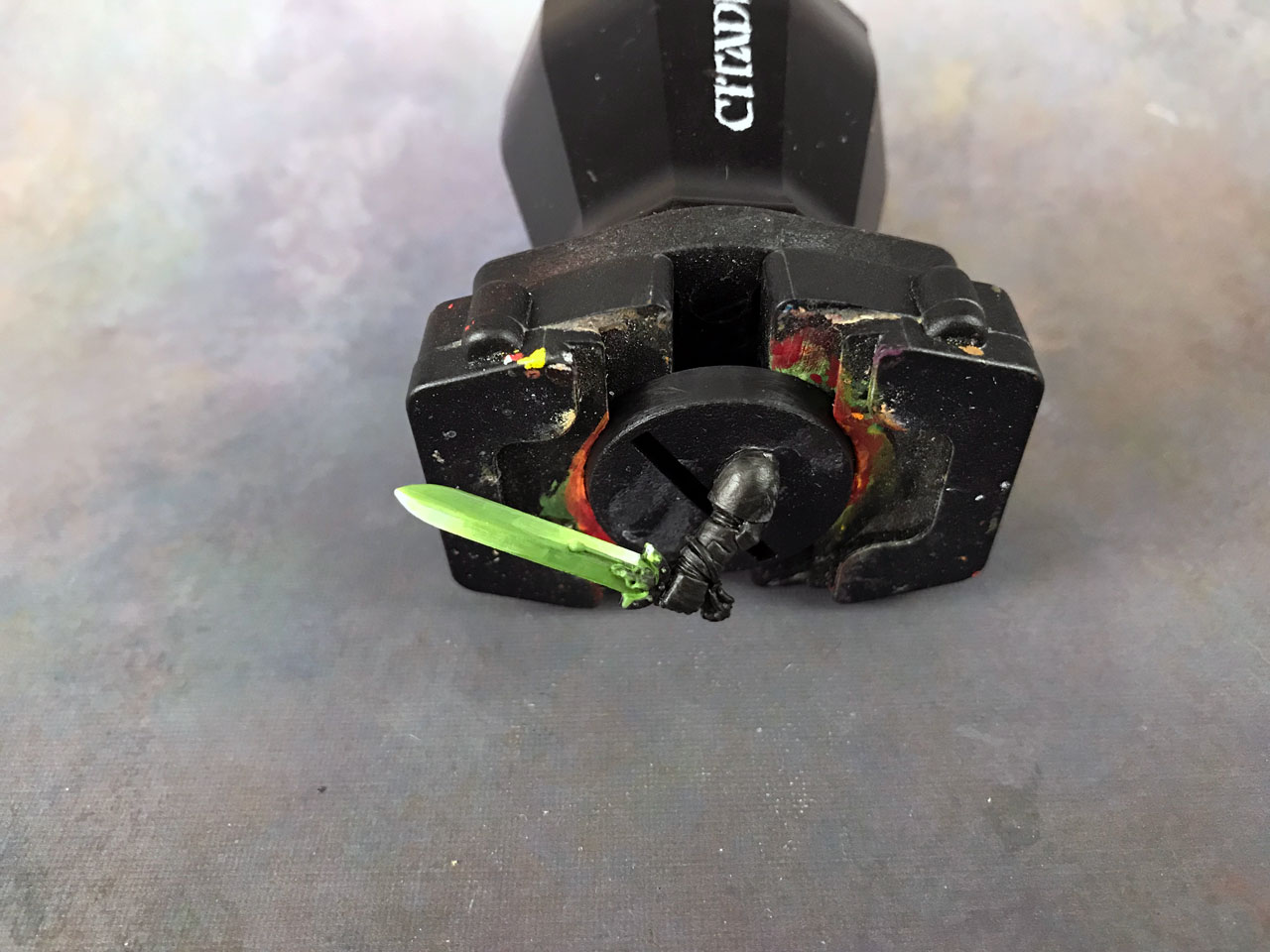
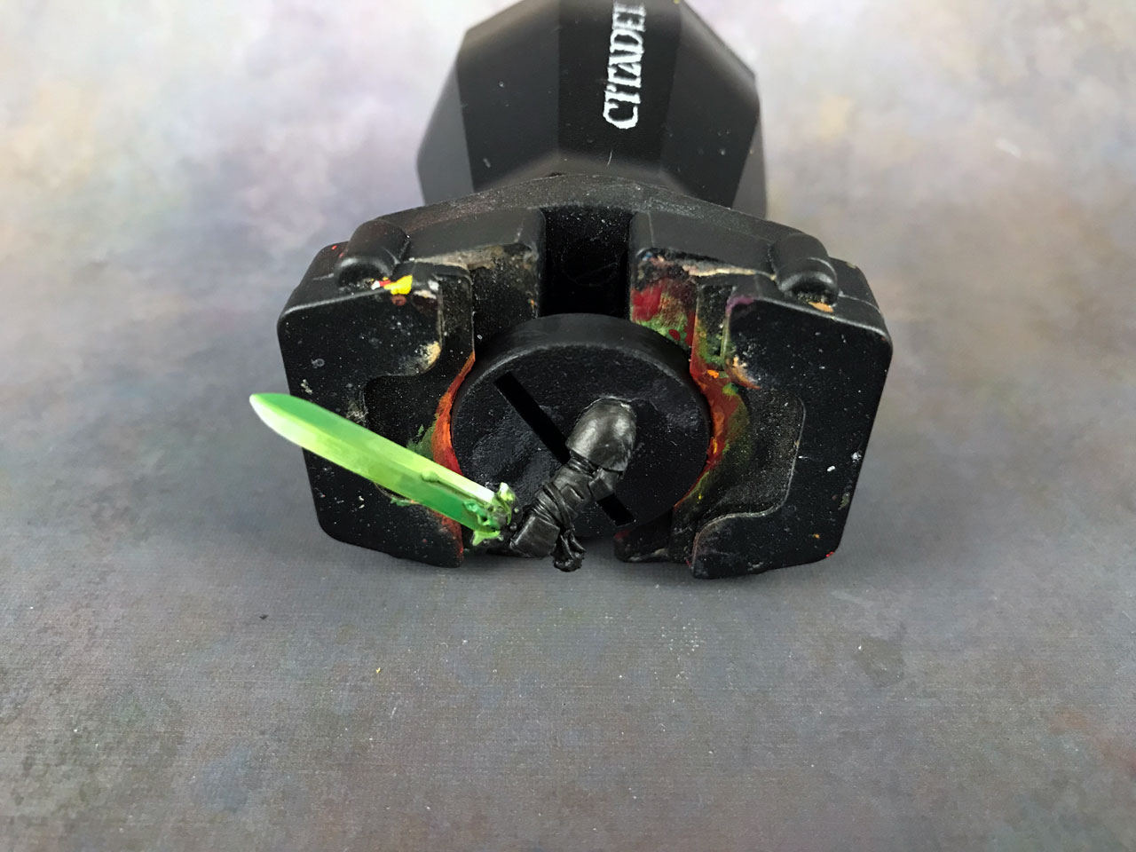
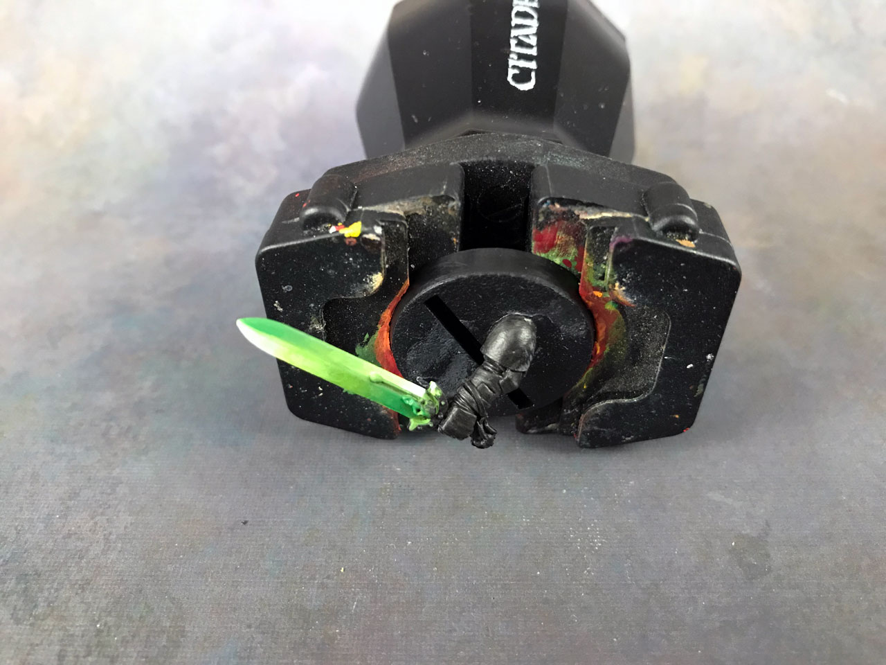
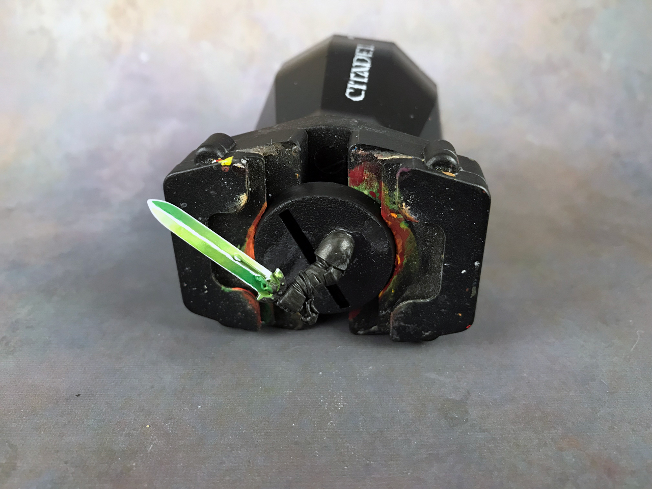
As usual, I also like to take a shot zoomed out at a more normal distance. It’s more like what you’d see on the table. When you’re zoomed in so close for so long, all you end up seeing are the mistakes.
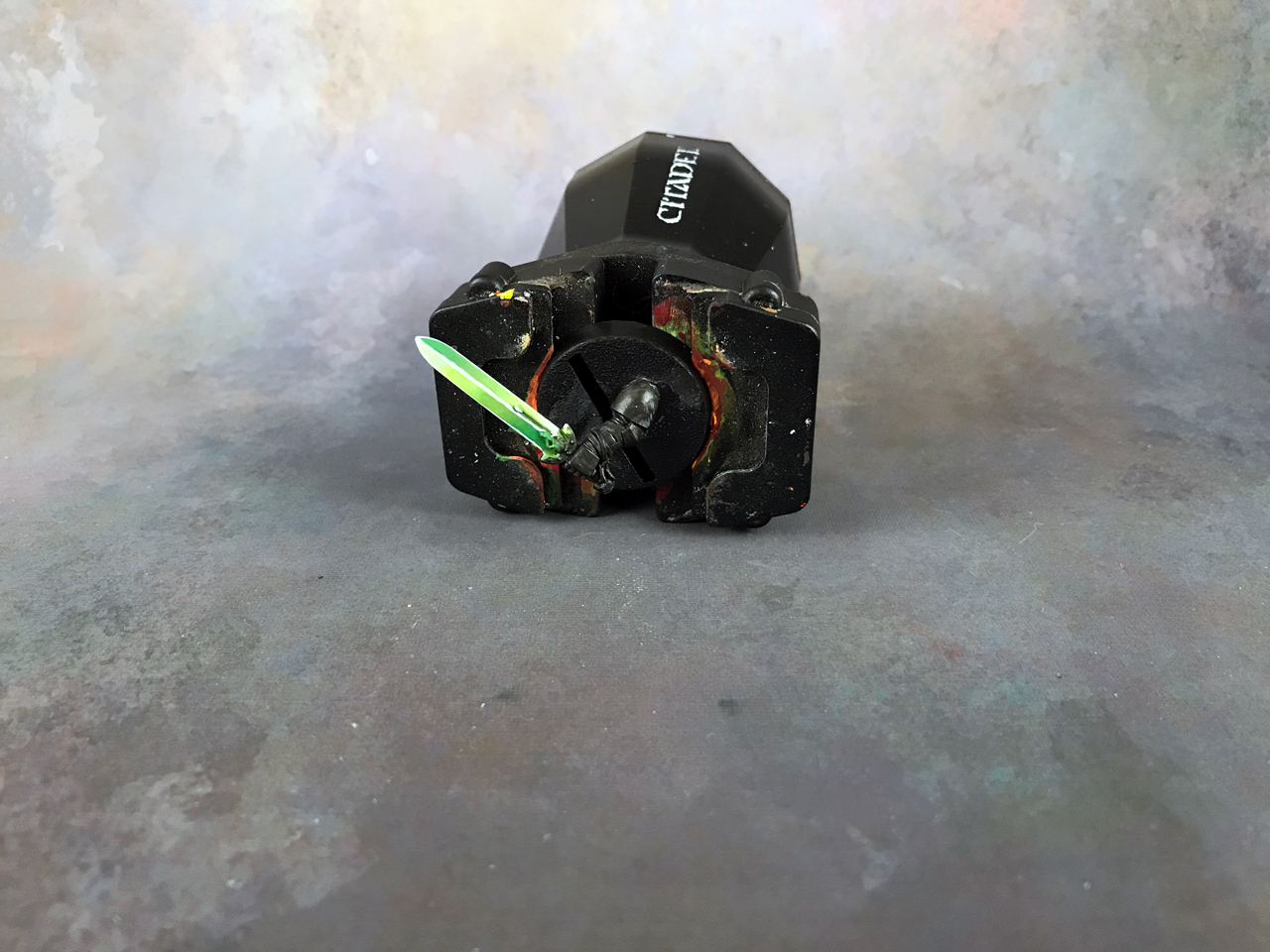
Like anything with blending, you could spend as much time making this all perfectly smooth as you like. I could have easily spent another 10-15 minutes on this to get all those transitions really smooth.
If this were a weapon for an important model then I may have. However, for the sake of this tutorial, and to not bore you to death with 50 pictures, I called this complete :)
Other Examples
Just to show you that you can use other colors.
Here’s a Berzerker Skull Champion I painted a few years ago now using this technique with blue.
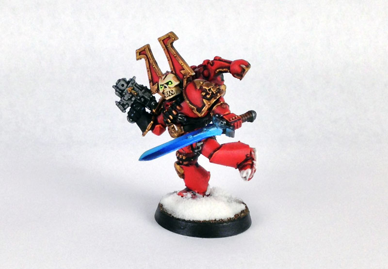
Unfortunately, I didn’t get great shots of the weapon, and my lightbox wasn’t very good at the time. However, you can see how I didn’t edge highlight with white and how doing that really steps it up.
Here is a Herald of Khorne I painted. This is where I worked out how to do this technique and you’ll recognize the green.
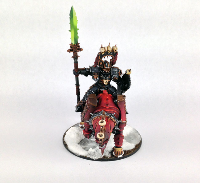
Again, there’s no white edge highlights, so you can see to compare.
That was the first time I painted a power weapon this way and I’m still very happy with that result years later.
Here’s another example using a different color.
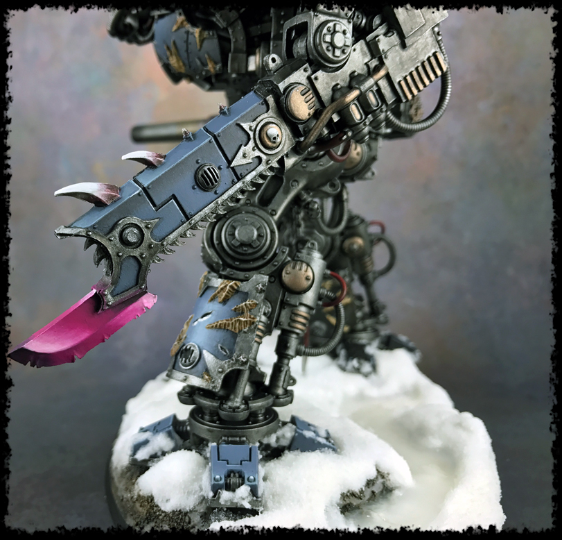
You can see how this technique would work on something like an axe. Granted, that’s not an axe above, but it’s very similar in setup to one.
I really should have pushed the contrast higher on that Chaos Knight weapon, and done the white highlighting, but I played it safe.
Final Note
It’s worth mentioning that while this technique was on a power sword, the technique works on any type of weapon. Granted, a sword is one of the easiest to do this technique on. But, you can still do this on an axe, hammer, etc.
Ultimately, the technique is to create high contrast using color (instead of a metallic paint) with a gradient.
So, on an axe you would paint the bladed edge like this. Then, on the flat of the axe, you could do the same and reverse the direction. On something like a hammer you could paint one side in one direction and flip it for the opposing edges to push that contrast.
It just takes a little creative thinking sometimes.
Also, this is the same technique I use to paint NMM weapons. The concept is the same, create high contrast. The only difference is the colors used.
Power Sword Conclusion
With a little practice and time you can paint some cool weapons. Like I said before, use any colors you like, it all works.
Also, if you wanted to take this a step further and create a glow coming off the power sword, an OSL effect, then I have a tutorial that covers that in detail as well.
Have fun painting!
Do you have some other way you like to paint power swords or magical weapons? Share in the comments!
Specific Painting Techniques & Tutorials
Check out these other tutorials covering specific techniques.
I love painting miniatures and teaching people how to paint. I also really love blogging, so I've combined those two passions here.
- Creative Twilight’s Future and My Thoughts (Feedback Welcomed!) - December 4, 2021
- My Top Gift Ideas for Miniature Painters & Hobbyists + Gifts to Avoid - December 2, 2021
- The Year That Was 2020 and Where I’ve Been - January 17, 2021
Thank you! I finally get that idea now for power weapons, the steps break it down nicely. I shall have to have the video on when I am trying to do them next.
Glad you enjoyed it. The blending takes a bit of work, and I honestly make it seem easier than it is, but practice and you’ll get it.
Awesome work! YOu have truly become a master. :) And I wouldn’t have thought to do the contrasting colors in a katty-korner type pattern the way you have. It really works!
p.s. – I really like that juggernaut model! I love how the warrior’s colors aren’t the same as the red jugger. Really makes each model shine as its own creature. Amazing job, sir.
Thanks.
I have always thought it odd to make the rider match the mount. I get the idea but it’s way more fun to paint each uniquely.
I can’t claim the technique as mine but thank you. It does work well.
This was my first ever attempt to paint swords anything other than metallic silver. Thank you very much this tutorial really helped.
I’m so glad it helped!