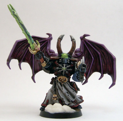
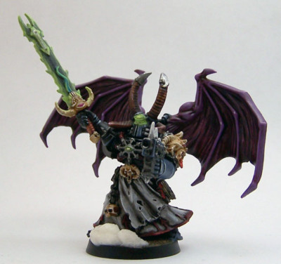
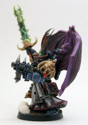
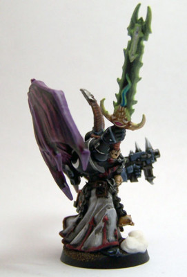
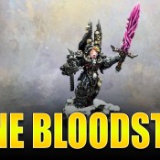
A few days later than expected but my Chaos Space Marines Sorcerer named Warforce is now complete.
Chaos Sorcerer (Warforce) Gallery
Painting Thoughts
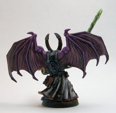
For those who haven’t been following along, the arms are magnetized as well as the backpack, which counts-as a jump pack.
Overall I’m really happy with how he came out, especially considering what this model started off like. This was a Finecast model I got 1.5 years ago. It sat in the blister pack until a few months ago and I quickly realized what rough shape it was in. That’s what prompted the head swap, sword arm swap and the backpack, though that backpack was a normal one and not winged but I won’t be using it at all.
As I mentioned in a previous update, I’m really happy with how his robes came out. I was skeptical, as I usually am until I start shading and highlighting things. All that white against the rest of the model was glaring but once I got the wash on there and layered it up I realized it was the right choice. I also wanted him to stand out a bit on the field and the robes help do that.
Also to that end is the sword. I’m working out different power weapon technique and like how this approach works. It’s also not the purple/pink I normally do and that’s because I wanted his force weapon to be unique. In the short stories I was doing I mentioned his eye lenses light up a bright green, so I ran with that there and continued it on the sword. I think it works.
Anyway, another HQ model down. I’ve been pushing to get more HQs painted up because I hate finding myself trying to make lists for events that need fully painted HQs and having too few choices.
- Creative Twilight’s Future and My Thoughts (Feedback Welcomed!) - December 4, 2021
- My Top Gift Ideas for Miniature Painters & Hobbyists + Gifts to Avoid - December 2, 2021
- The Year That Was 2020 and Where I’ve Been - January 17, 2021
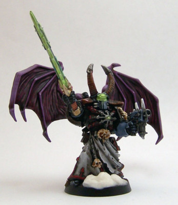

He looks great, but the glow from the three eyes bleed together too much. It looks like his helmet is glowing from the point between them. I think it would help if you darkened it a bit under the third eye, or if you brightened the eyes themselves, to reinforce that the eyes are the light source.
Other than that he’s spot on!
Thanks.
The glowing bits on the helmet annoyed the hell out of me. With the way the lenses are set beneath that third eye it all flows together. It’s hard to see but basically the lenses are set directly underneath the third eye’s bottom edge. From a realistic standpoint it’s pretty close, the lighting effect, considering positioning but you’re right in that it does bleed together. I redid that whole area a few times trying to get it perfect but eventually gave up to avoid getting the paint too thick.
I’ll have to take a look at it again and see if I can maybe get a distinction in there. The model is sealed at this point so if I mess it up at least I can clear it off.
I think a thin black line in the fold under the third eye would be enough to separate the three. The light coming out wouldn’t really wrap around surfaces so there should be a recess there that isn’t quite reached. If you carefully brush a black ink or wash into that fold you should be able to pick it out without darkening the rest of the effect.
Yeah, think I’ll try hitting that lip under the third eye with a black wash. It’s such a thin area and I feel like light would still reach it from the eye lenses illuminating outward, though not so much from the third eye. I mean that area is barely an edge, which I know would catch light from the eye lenses. My point, it’s going to have to be a damn thin line!
It is going to need a damned thin line, just enough to create a little separation. It may be tough to pull off but I have faith in your skills!
It would have been easier had they put lenses in the eye sockets but you’ll notice there isn’t. Trying to get the eyes to appear as a source in such a sunken area, and of course a small area, was my aggravation. It actually is brighter in the eyes but the camera didn’t pick up on it. You can see it a bit better in that second shot, horribly labeled #5.
Anyway, blah!
Here’s a good view of what the head looks like:
Looks great, man! Your stuff seems to be getting better and better :)
Are those wings from the Reaper line? I have a bunch of them in blisters, but haven’t had occasion to use them yet.
Thank you. It’s amazing what years of painting will do for your skill level ;) I’ve also been painting this Chaos army exclusively for about two years, so I have their style nailed down by now.
Those are the Possessed wings from the current kit. There’s two backpacks in the box with wings.
A good glow effect is pretty dang annoying to achieve, not to knock it but I think this one just dominates the model. It may be technically correct but I think it just needs more contrast or something is ya know missing.
Model still looks great though. I hope I get a chance to get down there and throw down in a week or two. (And I promise I will post something soon, new baby and work have been crazy).
I honestly did want that to be a focus, which is why I opted to have that third eye glow as well. I wanted him powering up the force weapon, be in the processing of drawing energy, and to me a more subtle glow (which is what I normally do for normal lenses), wouldn’t confer that. So, having that dominate the model suits me, it’s where I want the eye (though some may disagree), however I agree that I need to break it up a little as I was discussing with Tyson. If I can get that third eye separation from the eyes then I’ll be happy with it.
Once I seal a model I kind of write it off. I don’t like painting over sealed models because things never blend in the same and then, normally, you need to seal in the new additions and in turn create a brighter sheen. Anyway, sealing a model is generally my way of saying, “Fuck it, it’s done for better or worse.” I’m going to make an exception to try and clean up the source glows a bit, if possible, but if it becomes a chore I’ll just say screw it.
Sorry for the ramble. Can you tell it’s bugging me a bit? Anyway, thanks. Every model is a learning experience and the day I get ever single element right on a single model is the day I stop painting.
You coming down for the 14th tournament or just some random Wednesday?
Oh, forgot something else I was going to say – if that last wasn’t enough.
I agree about the technically correct bit. I do a lot of techniques that are technically incorrect in terms of realism because I like the way they look. I almost always put aesthetics above realism. I use realism to ground a technique but not define it. I was just saying the glow isn’t wrong, it’s close to real, but I wasn’t arguing that it doesn’t need some definition.