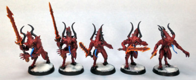
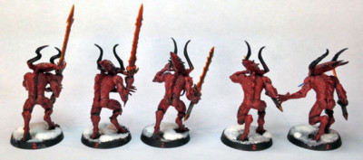
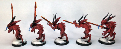
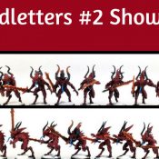
Not terribly exciting, but I did finish up five Bloodletters.
Bloodletters Painting Showcase
Painting Thoughts
These guys got a tabletop standard paint job, so nothing amazing.
I did spend some time on their swords though. Often when I do quick paint jobs like this, I will pick an element and make it the focal point, and the swords are an obvious choice here.
It was mostly done with some basic layering and then a glaze over it after to try and smooth it out. I think they came out pretty decent.
The skin was just base coated and washed. I did some quick dry brushing after to pick out some elements, and also some quick layers for highlights here and there.
Again, just a really simple paint job on some models that probably won’t live very long ;)
I think the color of these Bloodletters really works well against the snow basing. The basing is standard on my Chaos models, but some just look better with it than others.
Conclusion
There you have it. I have five more Bloodletters to do but at the moment I don’t need them so it may be a while until I wrap up the rest of the squad.
Time to see how these do on the table.
- Creative Twilight’s Future and My Thoughts (Feedback Welcomed!) - December 4, 2021
- My Top Gift Ideas for Miniature Painters & Hobbyists + Gifts to Avoid - December 2, 2021
- The Year That Was 2020 and Where I’ve Been - January 17, 2021

They look great Thor, the swords really make them pop.
Are you using them as allies or summoning them?
Thanks.
Right now they are used as allies. Trying to build up my Daemons more so I can look to use summoning though.
The orange swords are very nice but I also like the blue tongues.
Thanks.
For some reason I thought I had done the tongues on my last unit that same color and it wasn’t until after these were done that I realized I did a different color. Oh well. I also like the blue, gives some nice contrast, and now helps differentiate the units :)
Yeah I gotta second that- the blue tongue is really cool.
Funny how the little things on models will make ’em stand out, but that blue really does the trick.
Also helps that I’ve always thought they were cool lookin’ beasties.
:)
Getting the details right makes all the difference for sure. I never thought so many would like the blue tongue though.
They are cool models. I have an affinity for Khorne though.
I like the swords. Highlighting the edges so dramatically makes it look like the heat is focused into the cutting edge.
Thanks.
The last time I did the swords I did the blade center as the heat source and radiated outward, which seems the more logical method. It looks good but I wanted the edge to stand out this time. I figure, if I wanted it to be realistic, the edge is the source and you’re just not seeing the flame that would be coming off the edge.
I’m not sure the powers of Chaos concern themselves too heavily with the laws of physics…
True enough. I like to try and paint with reality in mind but I definitely don’t let it dictate everything. If I think something looks cool but doesn’t obey some law (be it lighting, pyschics, etc), then I’ll still do it.
Very nice. I feel I am repeating the commenters below, but the blue tongues and orange swords really look good and make the minis stand out :)
Thanks!
Khorne models are the bestest. Something for you to maybe experiment with, and it worked wonders for my bloodletters, try giving all the bumpy areas and the face (especially the face) a light drybrushing of white. It brings out the details nicely and gives them a skull looking face.
I agree. Khorne models are my favorite by far and it helps that they are all about assault since that’s my favorite thing.
I’ve seen that done and it does look awesome, as you said, especially the face. I think I’ll reserve that look though for my Heralds, let them stand out from the pack a bit.