I thought it would be fun to start a new series here. The concept is simple: you send me pictures of your models and I help you improve your painting.
I put this out to my newsletter subscribers a bit ago and got a response. I don’t want to name this person directly, so I’ll use R as his name in this article.
As I said to my newsletter subscribers, and of course to R, the idea behind this is to give constructive criticism. I want to help people get more confident in their painting, to be proud of their work, so I’m not here to tear anyone down; quite the opposite.
Preface out of the way, let’s dive into what R sent me!
The Critique
Now, R wasn’t comfortable with the pictures he was talking. See, taking pictures of your work seems to enhance any mistakes you made and just makes them glaring. I told him that I’ve been painting since 2006 and I hate looking at pictures of my work still.
While I may not have any great advice in this department, hopefully the knowledge that most of us don’t like looking at our own work in this way is a small comfort.
Oh, I can say this, post image editing can help a lot with images though. R will notice that the images he sent me are cleaned up below. Using Photoshop I adjusted color balance, tone, and brightness to get the images to a more natural look.
The images that were sent to me were untouched and the colors off. A little bit of photo editing in your favorite software to adjust things back to how you saw them when taking the pictures will go a long way.
Not everyone has Photoshop, but I know you can get Gimp for free and it’s been around for a very long time now and has been the choice of many for years.
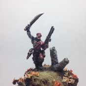
Chariot #1
I apologize that I don’t know the proper name for some of these models.
Also, R told me he’s a really new painter, just to give a baseline to work from.
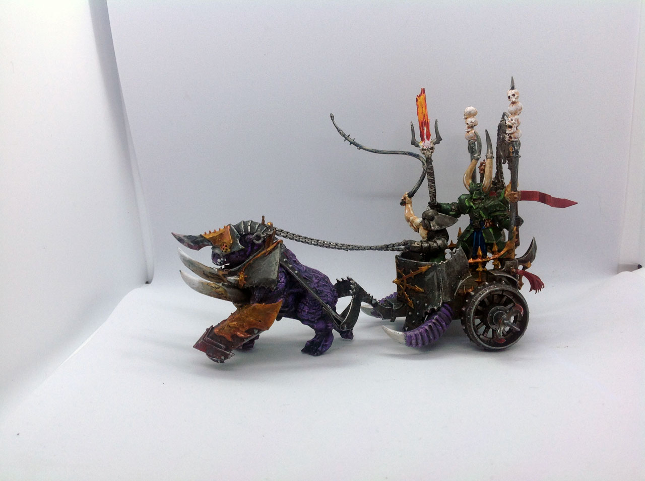
First things first, the paint is where it needs to be. I know that seems like a softball, but having good brush control as a new painter is crucial. When you have good brush control and can keep the paint on the right parts, instead of slapping it all over the model, then you set yourself up for success.
I’m impressed by the fact that R is shading and highlighting, and he totally on the right path there. Shading and highlighting are fundamental to anything you paint, so starting off with it out of the gate is awesome.
The paint seems thin. I do see some areas where the paint seems built up or too thick, like the flame effect on the halberd, but overall a very good consistency on the paint.
All great qualities in a new painter: brush control, shading and highlighting, and thin paint. Those are the building blocks for any painter.
My first suggestion would be for R to work on his edge highlighting. I can see it on the Chaos Knight and it’s a bit too thick/wide. Ideally those highlights would be very straight and relatively thin.
Edge highlighting is tricky for beginners, so no offense to R at all here. Getting thin, clean lines take some practice. To that end, I do have a tutorial on edge highlighting.
The other thing that really helps here is a good brush; it can’t be overlooked. I’m not saying you need a very expensive brush either. I had great luck with the Citadel Medium Layer Brush for edge highlighting and blending. The Smaller Layer Brush is another good one as well. The great thing is they’re pretty inexpensive, about the cost of a pot of paint really.
I do also have an article covering brushes in more detail as well.
There are a few areas on the model that aren’t quite fully covered with paint that could easily be fixed. I noticed the paint isn’t fully covering the undercoat on the chariot’s purple horns. Just another thin coat of paint and it’s good to go.
All in all, I feel that R is doing a great job and is really headed down the right path. Some more experience and practice will really help.
Daemon Prince
R sent me in shots of various models. I don’t plan to cover each one in detail, as many of the notes in the first model are applicable to the others, but I did want to glaze over them all.

The most noticeable thing for me on the Daemon Prince is the layering on the skin. There’s a good clear definition between the shading and the layering. I like how it’s all clearly defined and it’s done well. A few highlights on the skin would help push things up a notch, but still a great job.
I do feel as though the gold/bronze on the armor could have used a darker wash. I feel as though there’s a wash on there now but it’s subtle. Using something like Agrax Earthshade would really help get the definition in there.
The fingernails/claws, it looks as though R may have dry brushed those. That’s fine, however, if he wanted to step things up a bit then I’d layer those.
Start with a dark grey, layer in a mid-tone grey, and finally a lighter grey or even white closer to the tips. Create a gradient for a smoother look, which is more typical of claws or fingernails.
I do like the model though and the painting. I do love Chaos.
Chariot #2
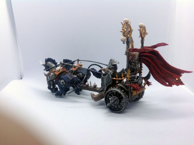
Overall, I feel this is a good piece. I like the colors, the paint is thin, there’s highlighting and shading – all the basics are there.
My suggestion to R would be to start looking at mid-tones. See, when I paint something there’s at least 3 colors I want on anything: shading, mid-tone, and highlight.
The mid-tone is your base coat color, the primary color you’re aiming for. Your shading is darker than that, and of course the highlighter brighter than that.
Having 3 colors helps give things a smoother look and a more natural look.
This is something washes are great for too. Now, you can use a wash to accomplish all of these things (more or less), but you can also use a wash to enhance some good layering.
If you put down your base coat, shade it, highlight it, and then wash it, then the wash will help blend it together. It will help smooth out the transitions in your layering and make it look like you spend some time blending.
As I said though, I do like the composition of this piece and R has done well. So, I figured I’d just help push him along a bit to step up his game.
Space Marine Captain
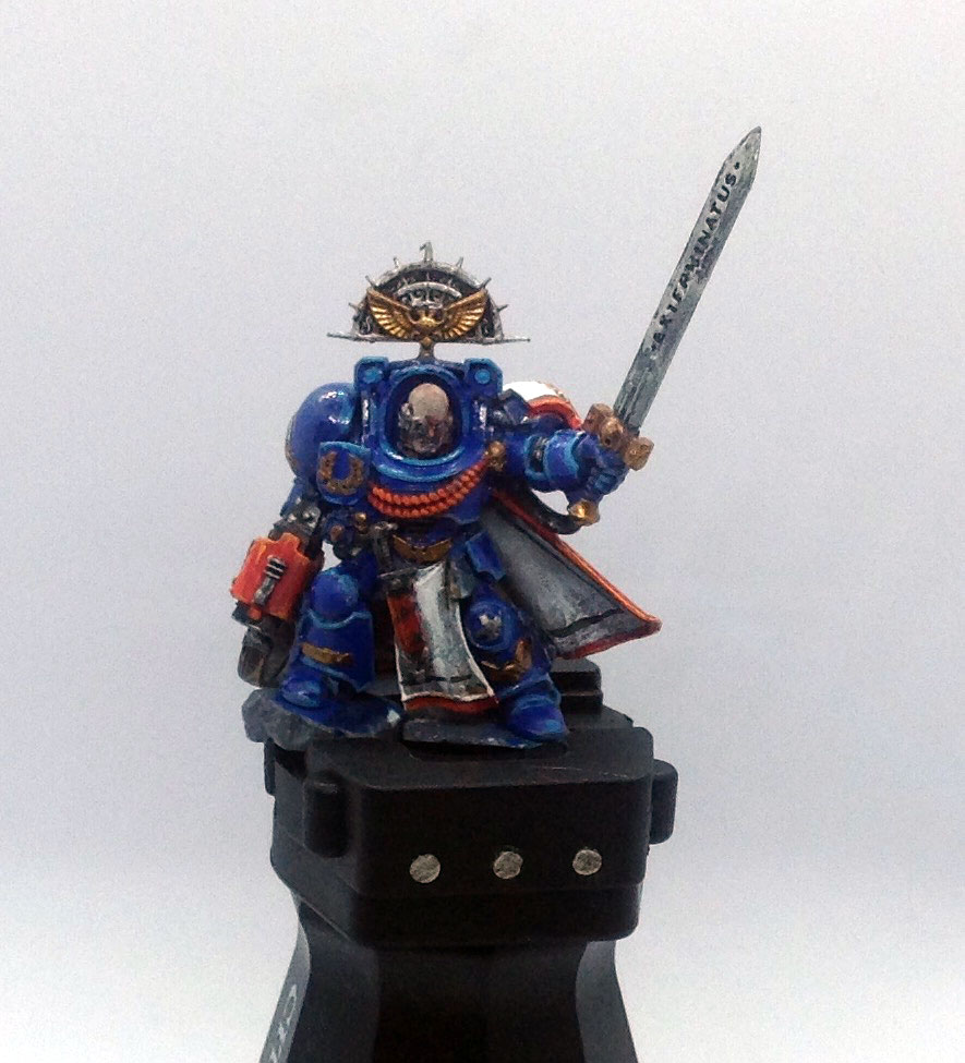
I think it’s a Captain…
Anyway. The blue armor is on there clean and smooth, which is great. The red is a great visual pop from the blue of the armor. The use of gold and silver is a classic way to break things up. I see the edge highlights on there looking pretty good.
I would definitely suggest using Nuln Oil for shading the white. It looks like R did some layering or dry brushing to work with the white. The thing is, white is tricky to work with. The biggest time saver I have for white is Nuln Oil to shade.
Paint the area pure white and then use the Nuln Oil to wash the area. Once that dries, come in with the white and layer/highlight the raised areas. It’s simple, easy to do, and looks great.
Just to give an example, here’s a Chaos Sorcerer I did that way.
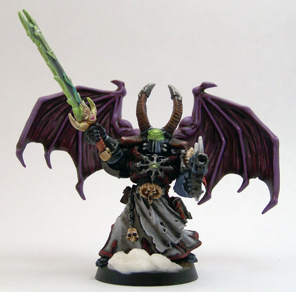
Going this method gives a nice, smooth, and gritty look.
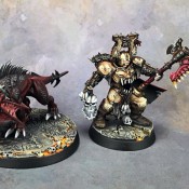
Chaos Knight
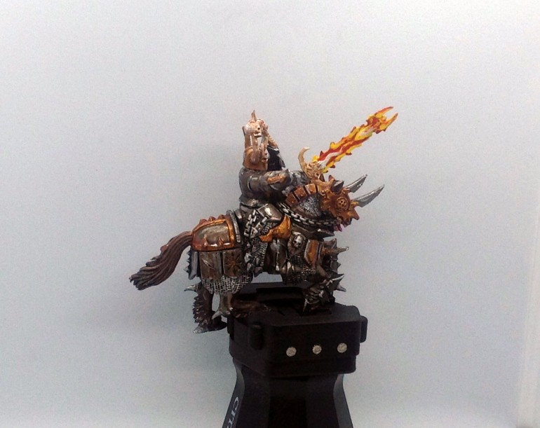
This one is my favorite. What I like about this is that it looks like a brown and black wash (maybe?) were used on the horse’s armor. It may just be brown.
Either way, it gives a gritty feel to the model that a black wash wouldn’t. It’s nice to play around with colors to convey different things.
All around, the miniature is well painted and composed well.
The paint on the sword does seem thick, and I imagine that’s because of the colors being used. Getting a solid yellow is a nightmare for most.
So, I would just suggest taking time to build up the colors on the sword to keep it thin, otherwise it’s a good piece.
Warshrine
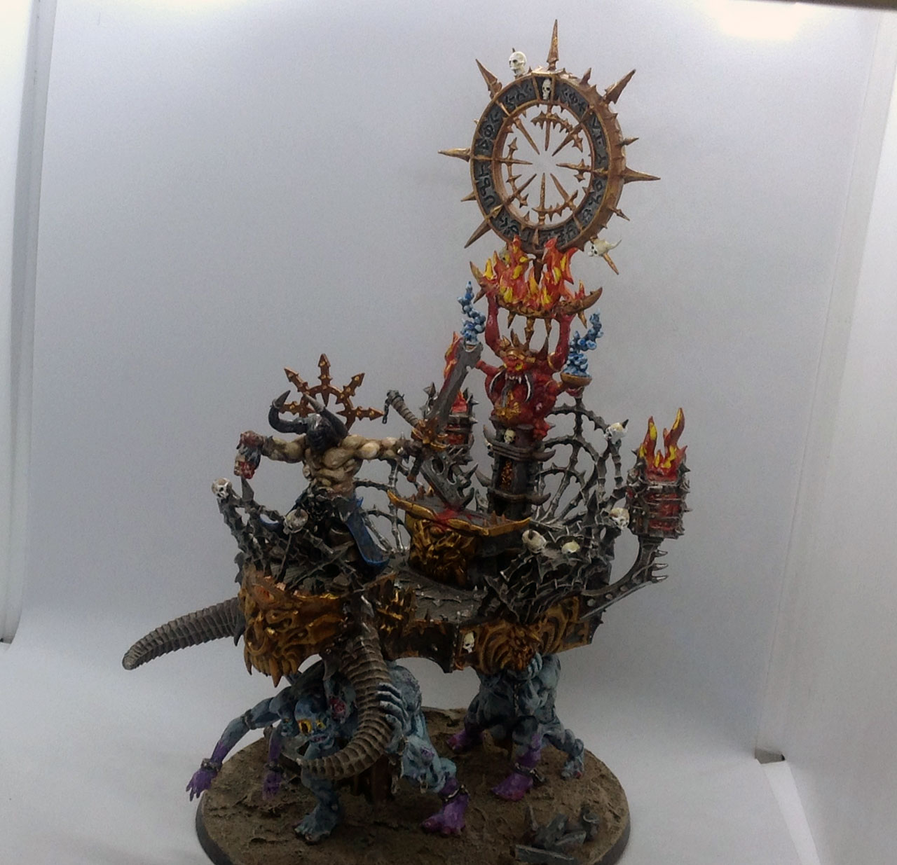

I like the blending of the blue to purple on the beasts holding up the Warshrine. If you need more help with blending, R, I do have a tutorial on blending with layering. From what I can see though, you did well there.
I also see some nice bold highlights on darker areas of the chariot that I like. The skin on the warrior is much cleaner than the previous models and I’m seeing 3 colors – I think.
R is consistent in keep paint where it needs to be and shading an highlighting everything. This is an intimidating piece to paint too, at least it would be for me if I were new, so I think he’s done an amazing job here.
Other than some of previously mentioned suggestions, I want to go back to the 3 color thing. The horns coming off the front of the Warshrine are great, and I also feel they would be a good focal point. I see R has them shaded and highlighted, which is great. However, it could be enhanced easily.
Now, my 3 color suggestion is applicable to every component. If you look at something generally then you have: shading, mid-tone, highlight – 3 colors. You can apply that rule of 3 to each element too if you want to push it. Meaning, you can have 3 colors for highlights, 3 colors for shading, and 3 colors for mid-tone.
I’m not suggesting going that crazy yet, however, on this model I feel that working in some progressively brighter highlights would be great. About mid-way down the horns I would dry brush another lighter highlight and work that towards the tips. Then about the last third (near the tips) I’d do another brighter highlight dry brushed out to the tips.
That would give 3 colors for highlights that blend out to a lighter color at the end/tips. I would create some great visual interest.
Conclusion
First off, I want to thank R for being brave enough to send in his work for this. I hope I gave you some pointers without being harsh. I feel you’ve got a lot of potential and you just need some more experience to get there.
If you enjoy painting, then just keep pushing yourself. Work on learning a technique, get comfortable with it, and then find another technique to learn. Just keep pushing.
Also, I see you setup a light box for this, which is awesome. The lighting did seem a bit off in the originals you sent me, so I would suggest you get yourself some daylight LED bulbs if you can. I cover it a bit more in my article on my DIY light box setup.
Well, this was more long-winded than I thought it would be but hopefully helpful to those reading this as well as R.
I love painting miniatures and teaching people how to paint. I also really love blogging, so I've combined those two passions here.
- Creative Twilight’s Future and My Thoughts (Feedback Welcomed!) - December 4, 2021
- My Top Gift Ideas for Miniature Painters & Hobbyists + Gifts to Avoid - December 2, 2021
- The Year That Was 2020 and Where I’ve Been - January 17, 2021
Solid constructive feedback, I like. If R is only new then I am envious. I was woeful starting off.
Thanks.
Yeah, I can’t say for sure how long R has been painting, just that he referred to himself as an “absolute novice”. He’s definitely headed the right way with his painting.
Thanks for that. I started painting plastic miniatures about a year ago. The warshrine caught my attention when i dropped into a citadel shop one lazy afternoon. As i have been looking at the experts on youtube, pinterest and of course Thors work, i have gone back and tried to add a bit of what i am picking up.
R
Cool concept for a series! R is way ahead of where I was even after several years of painting Minis.
The “Chaos Thing” is a Warshrine, btw.
Ah. Warshrine – thanks for that.
Thank you Westrider for your comments. I think Thor has been a little bit reserved in his critique as his first “guinea pig” as i called it.
I like doing chaos because you can experiment with different colours unlike armour but promised my boy i would do him some ultramarines. Usually always put helmets on figures because i struggle with faces, they are so small lol.
I love working on Chaos for that reason too. You can really experiment with things, try stuff out, and it just works. That’s a lot harder to do with say Space Marines.
I started with Chaos as well, and it’s still far and away my fave Faction, in large part because there’s so much freedom for modeling and painting.
I was entirely serious in my comment there. I didn’t get around to even trying any degree of blending until several years after I’d started painting, and I think it was over a decade before I tried to tackle flame effects.
The main things that jumped out at me were the reds, yellows, and whites. Those are always tricky, and really need to be built up in layers. It often helps to start with the Base paints available in various lines, since those have a much heavier pigment load than the brighter shades. For white, I usually build up from a light grey or brown; you can get a bunch of different “white” effects for different purposes depending on how you work it up. Thor’s suggestion of Nuln Oil is def worth experimenting with, too.
I prefer helmets not only because they’re easier to paint than faces, but also because it makes more sense to wear a helmet than to walk around waiting for someone to shoot them in their unprotected head. I usually keep faces (and flesh in general) pretty simple, just a solid base coat and a wash. It’s really not necessary to do much more than that, and particularly not to paint eyes in. Just shade the eye sockets and it’ll look fine. Some time when you’re watching TV or a movie, bring out some of your Models and hold them at an appropriate distance so they’re about the size of the people on your screen. See what actual people’s eyes look like when perspective has them scaled down that far.
Thanks Westrider every little helps and i hope more beginners and experienced will send theirs through. Its good to know others also have teething problems as most i see on screen just blow me away and intimidate a bit, getting good positive and negative responses are great for learning, thats why i originally asked Thor not to use my name, i may be 60 but harsh critiscm can still put me off things. Being reasonably new i did not understand much about washes and i have painted straight from the pot and found i am doing too thick a coat so am now thinning out more.
I have also found myself taking photos of cars, trees, animals etc to see how lights and shades can make one flat colour more 3D with highlights and edging lol.
Unfortunately never got into the actual game but the painting is really relaxing for me. I may just end up taking some down to that shop and see if any kids want them. But not the warshrine lol, that will always be my favourite.
Later i am looking to get an airbrush, i like what people can do with them especially around blending through colours.
An airbrush is something I have very limited experience with. They’re a great tool to have even if it’s just for simple stuff like priming, base coating, or sealing models. Of course, you can do a lot more with them too and are awesome for batch painting stuff.