This tutorial is a bit specific to the power sword being painted, which you’ll see below, however the technique and concept is universal. While being an irregular weapon, this is how I approach quite a few things when it comes to create glowing effects and glowing swords for my 40K models.
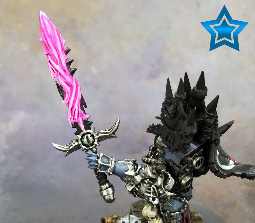
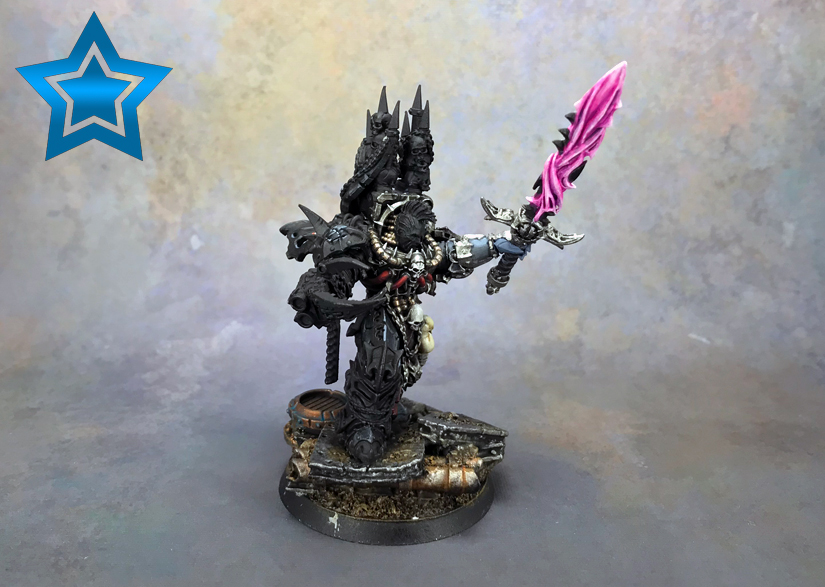
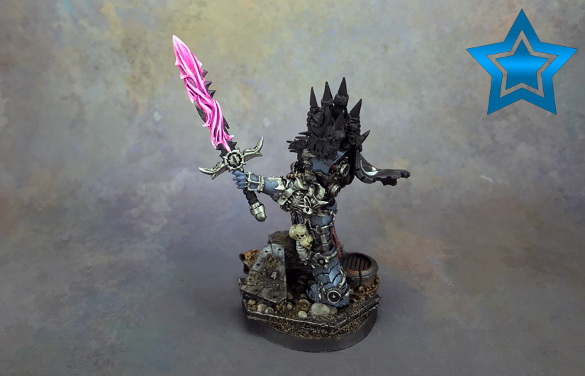
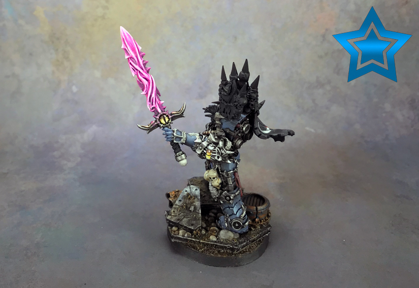
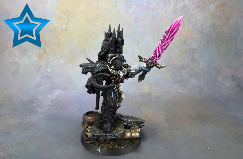
So, of course I’m talking about painting up a Chaos power sword. This particular weapon belongs to my Chaos Master of Crusade model, which is an Abaddon replacement by Grim Skull Miniatures. I did a review of the miniature if you’re interested.
The weapon on the model is covered in a swirling energy, which is what makes this different than a typical power sword. Instead of large flat surfaces, there’s a lot of edges and recesses to deal with.
Let’s begin!
Disclosure: Some of the links below are affiliate links, meaning, at no additional cost to you, I will earn a commission if you click through and make a purchase. The commission earned helps maintain this site.
Base Coat in White
I like to start this process off with the weapon being painted white. There’s two big reasons for this.
The first reason is that it will make the primary color that goes over it, in this case a Warlord Purple, really bright and already look like it’s glowing in one step.
The second reason is that with blending, which we’ll be doing, it’s generally easier to darken a color than to lighten it.
Starting with a dark color and blending up is often problematic with a lot of colors. It’s just very hard to get clean blends.
However, if you start with your lightest color and blend down then you’ll find the transitions are easier to manage.
So, I base coated the power sword in white. At this stage I’m sloppy with it since just focusing on a clean thin layer of white.
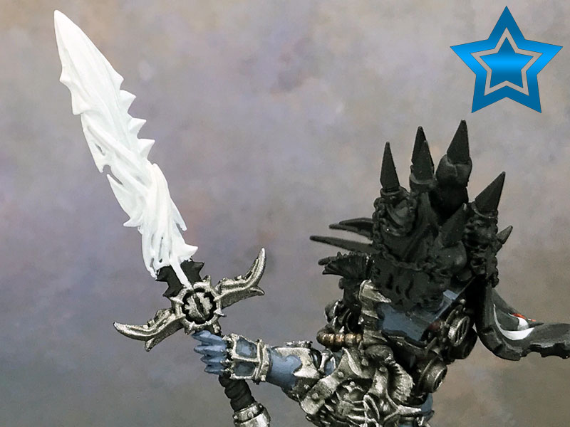
Now, the sword has some areas that aren’t covered by this swirling energy, so I go back in and pick those out after.
I’m going with black for the sword blade because I like the look I get when the weapon is done. Also, black weapons just seem very chaotic, which is perfect for this model.
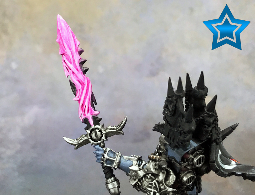
The First Glaze
This is where the magic happens. Pun intended!
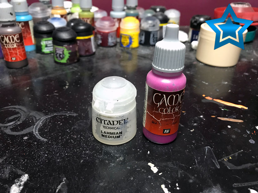
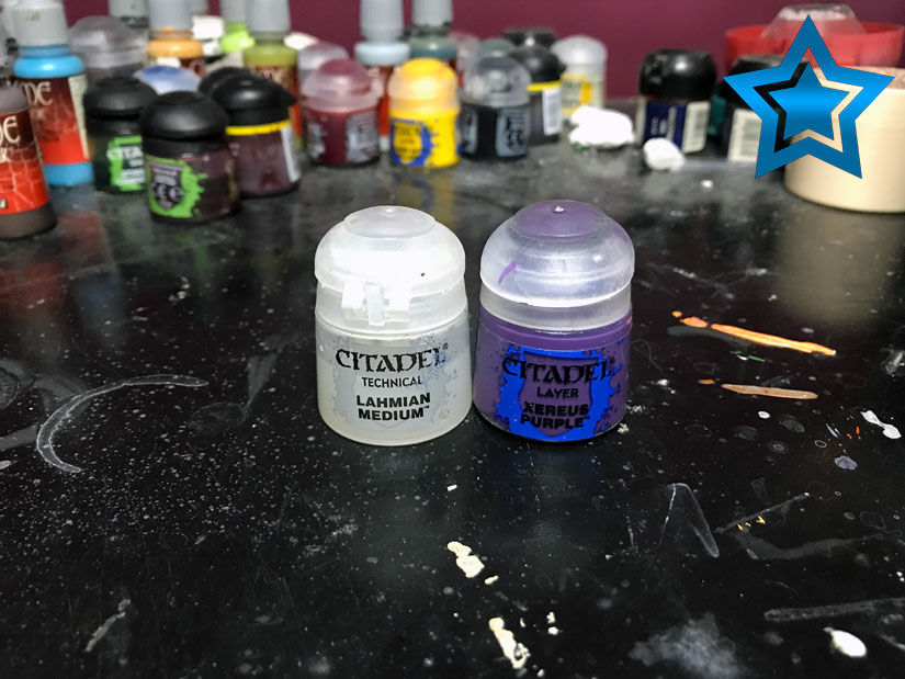
I’m using Warlord Purple and Lahmian Medium. The purple is my primary color, and the medium is to thin the paint out into a glaze. I mix this roughly 1/1. In truth this is more between a wash and a glaze.
You can use any primary color you want here too. The process is unchanged except the color.
So, I load my brush, run it over a towel to remove the excess, and cover the white. The trick here is not putting on too much, and working quickly, so don’t overload your brush like you might with a wash.
The brush I use for the rest of the work you’ll see is a Citadel Medium Layer Brush. If you’d like more information on the various paint brushes I use then you can check that out.
As you can see, it already has a nice effect. Hell, if you wanted you could stop here if you want quick and easy, however, I’m going to keep improving on this.
Start Shading
The rest of this tutorial is going to be a lot of the same. To get a good, smooth energy effect you have to use a lot of thin glazes to shade and bring colors back up. It’s tedious, but the results are well worth it.
Now, I take my thinned out Warlord Purple and do some more glazing. This time I’m focusing on the recesses and staying away from the high points. Again, keep it thin, don’t overload your brush, and take your time.
I go in a second time doing the same thing to darken it some more, but also leave some of the previous layer showing to create a blend.
Go Deeper!
Next I take Xereus Purple, mix in some medium to create a glaze, and go back to the recesses. I stick to the deepest areas, and go over where I did with the previous step. With it being so thinned out, the purple will lightly shade the areas.
You can barely see any of it, which is perfect.
As before, I do this another time to darken it some more and blend it in.
Bringing the White Back
Things are a bit sloppy at this point, so I take some white mixed with medium to create a glaze (we do this a lot), and touch up some of the higher points. As always, I do thin layers to blend in with the previous layer.
Also, whenever I come back in with the white I work the edges and also some mid-points. The energy is kind of in strands. So, I blend some white in the middle of those strands. This will break up the pink and create points of interest throughout the weapon.
More Warlord Purple Glazing
Back to the Warlord Purple for some more glazing.
I work around the white areas I just did to smooth out the transitions. Basically, I start the brush at the edges of white and work outwards to blend.
Let’s Do Some White Again
As I said in the beginning, it’s a back and forth process when blending. Well, unless you’re absolutely amazing and never make a mistake!
Thinned out white again and hitting the edges and high points to blend things back up some. I do this a few times until it’s smoothed out to my liking.
Time for an Intermission
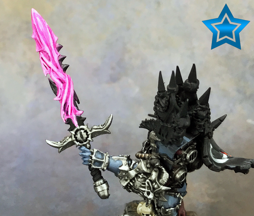
At this point I have the energy part painted to my liking. I have to finish the sword, so that I can come in and creating the light reflecting off it.
Here’s where things are now. I’m taking a shot further intentionally. When you’re working on something for so long it’s easy to see the mistakes up close. It’s hard to get every little part perfect with something so irregular like this, and it’s easy to get hung up on the small things. Looking at it from a distance gives you a new view, and you realize all those small things driving you nuts aren’t so obvious.
Back at It!
I got the rest of the weapon ready, at least the areas that will be hit with the light coming off the blade.
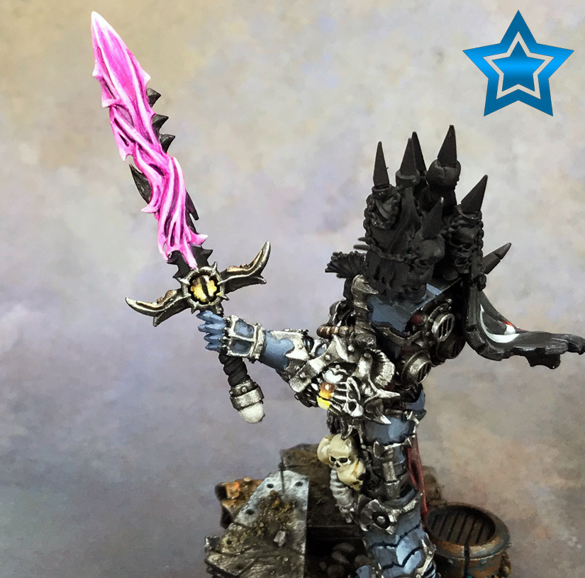

The thing you want to do, as you’ll notice in those shots, is brighten up the areas where the light should reach. Not just the immediate areas either. Even if the light won’t touch something, it’s still going to brighten the area up compared to usual. It’s a light source, hence the term object source lighting (OSL).
Working on the Sword
As you’ll have guessed by now, I’m going to glaze the glow on to the weapon. I’m using the Warlord Purple for this step. The reason being is that you want the brightest part of this whole effect to be on the weapon itself. The light the weapon throws off will be the mid-tone color, in my case the Warlord Purple.
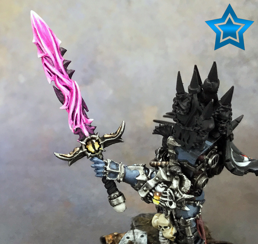
From here I glaze some more to smooth out the previous layer. I also focus on the edges where the light will reflect more.
The last thing I do is run an edge highlight of white on the sword. The edges will show the reflection more prominently. I then glaze over the white with the Warlord Purple to tone it down.
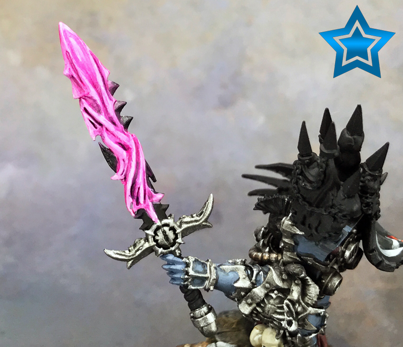
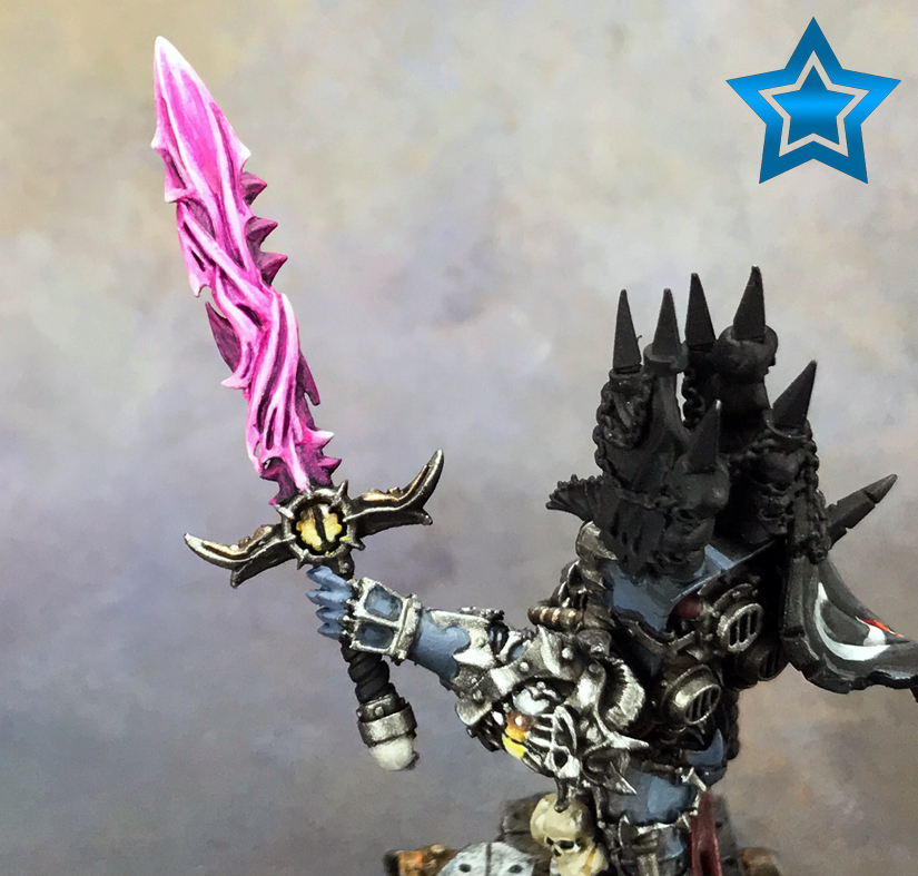
The Glow
The very last thing I do is create the surrounding glow on the hilt area of the sword. As usual, thin layers of Warlord Purple are used. I start further out and work back towards the blade. I do this a few times so it gets brighter closer to the blade.
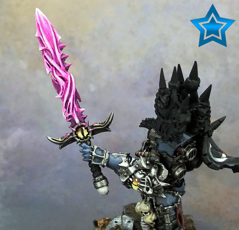
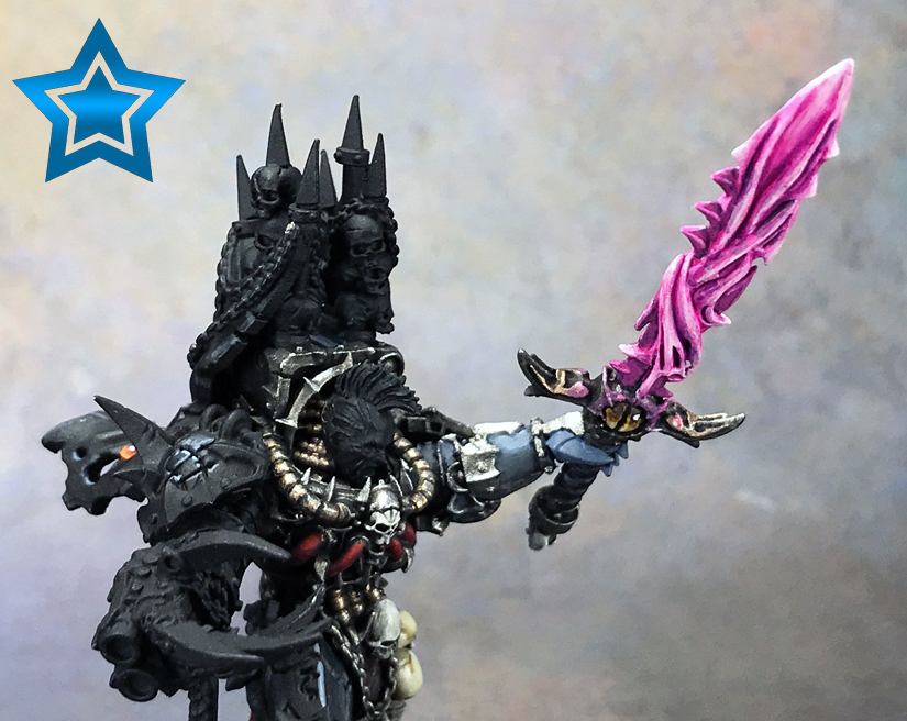
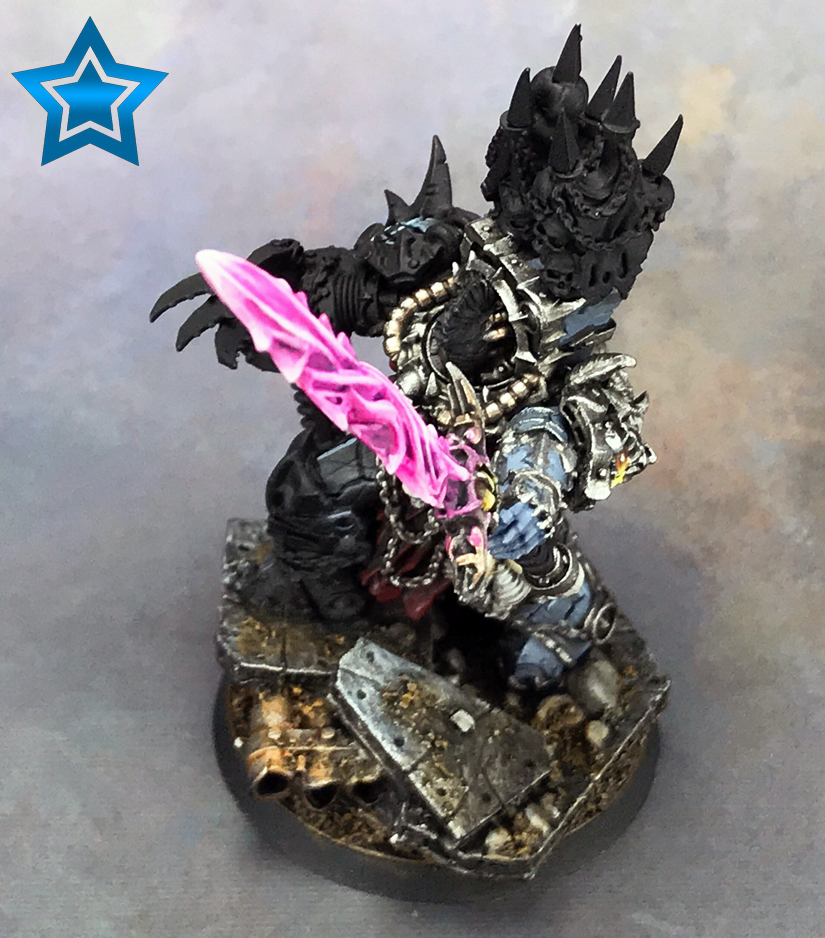
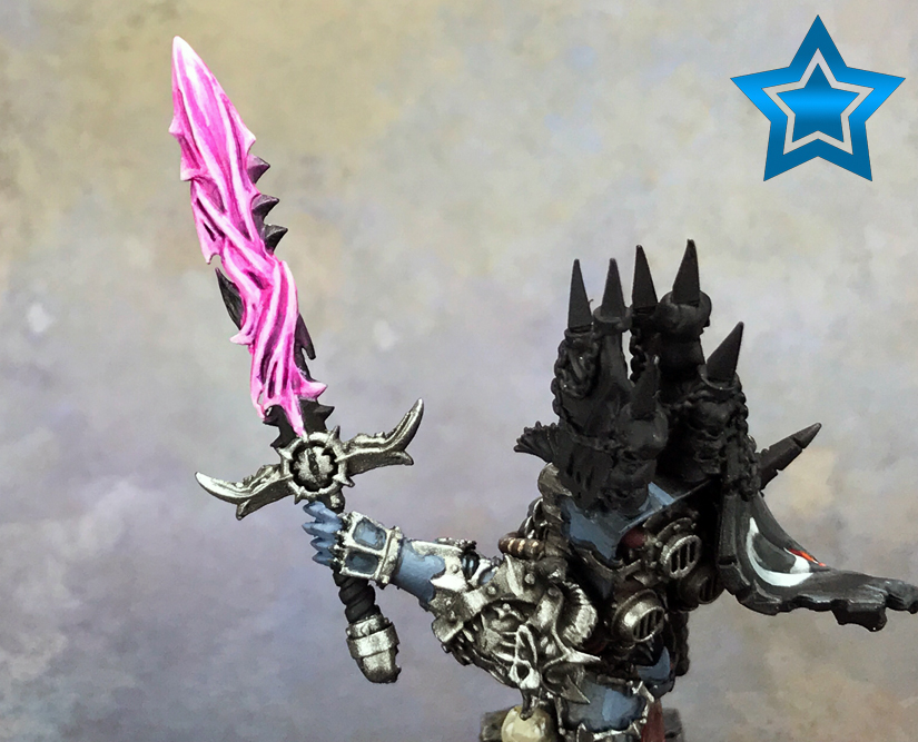
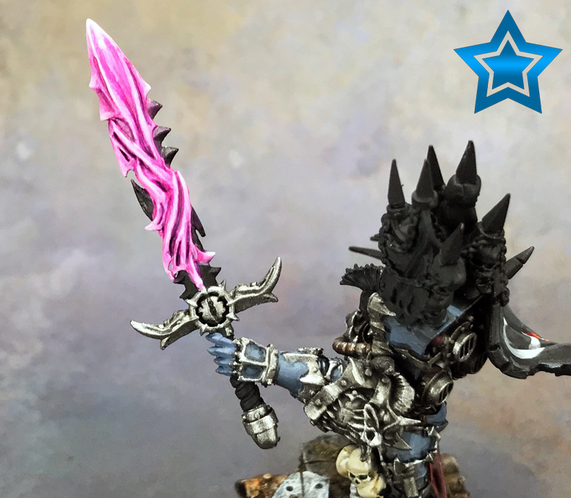
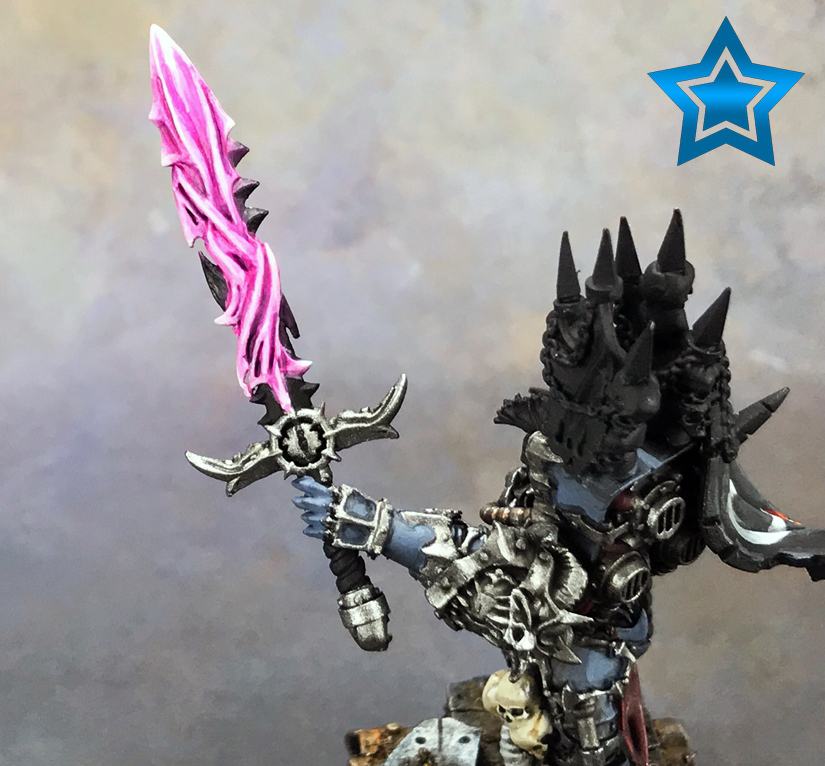
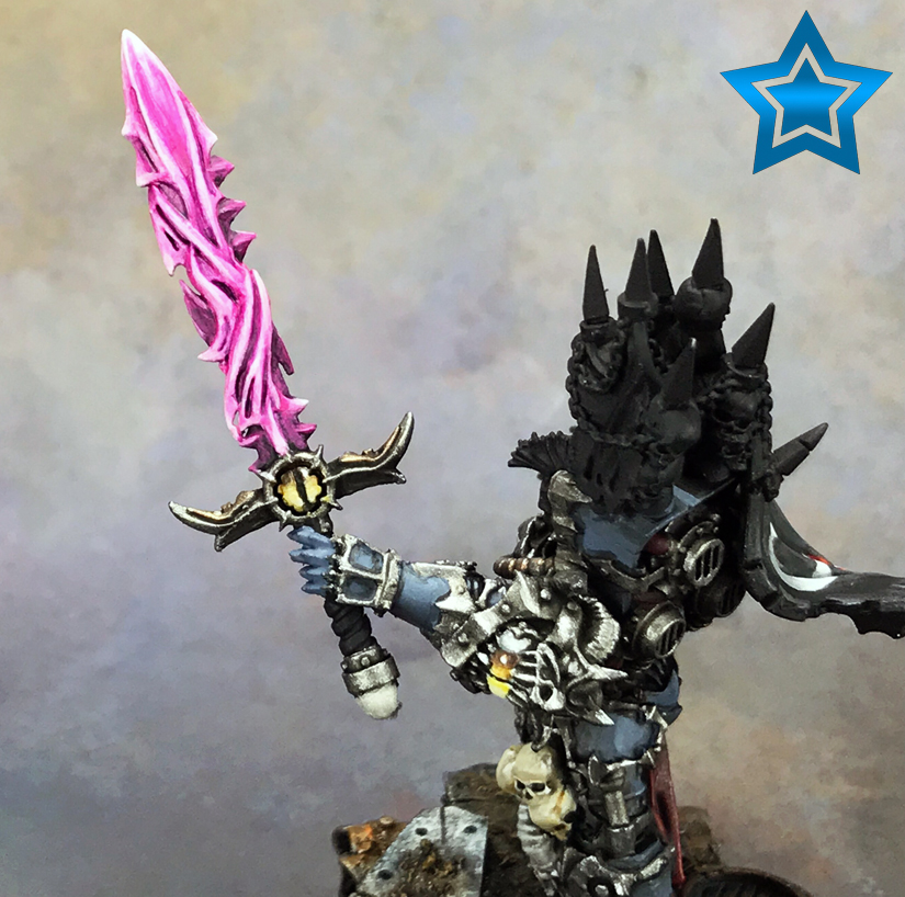
Energy/Daemonic Sword Complete!
With that done, the entire process is complete. Here’s a few shots to show the final effect.
Final Thoughts
I did want to note again that while I did this pink, you can use the same technique for any color. The tutorial is about the technique, not the color.
My biggest pieces of advice when tackling something like this is patience and persistence. You’re going to keep doing the same thing repeatedly and that’s fine. Build up to the effect, don’t try to nail it in one shot because it doesn’t work; I’ve tried.
Remember, keep your paints thin and don’t overload your brush. I always run my brush over a towel once loaded so it’s not too wet. You need to be able to control the paint, which is harder to do with it thinned out, so lots of thin layers is the goal.
Don’t be afraid of mistakes because you’re going to make them. Everything can be fixed with more layers and blending. Also, don’t stress it. I sometimes get so focused on one small screw up that I fail to realize I’m the only one who will ever notice. Step back and look at it with new eyes.
Lastly, paint for yourself. The work I did on this could be better. I could have smoother blending transitions, but I like how it looks and that’s all that matters. There’s better painters out there, but I don’t hold myself to their standards, just my own.
For the newer painters reading this, you should also check out my article on painting supplies every painter needs.
If you’d like to see the finished model, with the sword as a prominent focal point, check out my Abaddon the Despoiler painting showcase.
Specific Painting Techniques & Tutorials
Check out these other tutorials covering specific techniques.
I love painting miniatures and teaching people how to paint. I also really love blogging, so I've combined those two passions here.
- Creative Twilight’s Future and My Thoughts (Feedback Welcomed!) - December 4, 2021
- My Top Gift Ideas for Miniature Painters & Hobbyists + Gifts to Avoid - December 2, 2021
- The Year That Was 2020 and Where I’ve Been - January 17, 2021

I wish I could rate and recommend this higher. What a great tutorial. Am actually going to try some blending after this. The trick is, will I have the patience.
Much appreciated.
It really doesn’t take a ton of time to paint this all things considered. I probably spent more time taking the pictures than I did painting the sword. I’d guestimate (as I never track time) that I put around 30 minutes into painting this. It’s a lot of thin layers/glazes, and those dry very quick. So, you aren’t waiting but 30 seconds or less before you hit it again. You really don’t stop until it’s done; no real down time.
I have a Librarian Dreadnought on the go right now that I’m trying to figure out how I want to do his Force Weapon, so I was really happen when I saw this title. Then I realized that I want to do his the other way around, with the brightest part of the glow in the recesses. Still a nice guide to have for future reference, tho.
Just invert the process. Start with the darkest color as a base coat. Then glaze in the next step up in brightness, focusing on the recesses but going a bit wide. Next, go another level brighter and glaze that into the recesses, leaving a bit of the previous. Same thing, just the other way around.
That’s more or less what I’ve been trying to do, but it’s really hard for me to keep my hands steady enough to not schmear all over the upper layers. I almost always paint “outwards”, starting from the deepest bits, to avoid that.
The stark, hard lines and corners on it, rather than curves, make it harder to get something even, too. I’ve probably spent nearly as much time on the damn Force Weapon as I have on the whole rest of the Dread.
Gotcha.
I hear you on the time spent. I got lucky with this sword and it went quick, but that’s because all the details let the thing paint itself. When I’m doing a typical blade, a flat surface, I can put hours into getting it right.
Excellent tutorial.
I shall have to try doing this when I (finally) get around to assembling and then painting that wraithseer I have sitting in my box of projects. [It’s been there for nearly two years now. I don’t collect Eldar and got given the kit as a present.]
{Now back to playing around with weathering powders, washes, washes and mixing trying to get the look I want.} (Working on my nurgle dreadnought and experimenting with some techniques I’ve not used much.)
I find Nurgle models to be a great way to experiment and play around. Even if it doesn’t come out perfect, it probably still fits in with Nurgle. It’s hard to go wrong there.
The pink looks really good, and is very a striking with your colour scheme. Great tutorial too, very thorough :)
Thank you. I really want to do some more tutorials, so we’ll see if I manage it ;)
fantastic tutorial Thor and I love all the pictures and thoughts on how you go about the blending. I especially like your point about stepping back and looking at the mini from a distance.
Thank you.
Stepping back is something I struggle with, which is why I felt it’s worth mentioning. When you’re painting with something inches from your eyes, you see it all – especially the flaws. Those flaws that will only be noticed if viewed inches from a face will drive me nuts. I have devoted hours into “fixing” something that nobody else will ever notice. So, I had to learn to hold the model at arms length and judge it.
Holy poop, man! You’re a master! The rest of the model (thus far) is equally awesome looking. You’ve really processed yourself into a master of your craft.
I really appreciate it. I wouldn’t call myself a master though. Just someone having fun :)
You’re really good and you come off as legitimately humble. Good guy Thor.
Thank you.
“When you’re working on something for so long it’s easy to see the mistakes up close. It’s hard to get every little part perfect with something so irregular like this, and it’s easy to get hung up on the small things. Looking at it from a distance gives you a new view, and you realize all those small things driving you nuts aren’t so obvious.”
and
“Don’t be afraid of mistakes because you’re going to make them. Everything can be fixed with more layers and blending. Also, don’t stress it. I sometimes get so focused on one small screw up that I fail to realize I’m the only one who will ever notice. Step back and look at it with new eyes.
Lastly, paint for yourself. The work I did on this could be better. I could have smoother blending transitions, but I like how it looks and that’s all that matters. There’s better painters out there, but I don’t hold myself to their standards, just my own.”
If *only* I could convince myself to live and paint by these words! This is easily the most crucial advice in the entire article.
It’s not easy, and I wrote it here just as much as a reminder to myself as it is advice for others. We all get hung up on our own work, and we are our own worst critic. I’ll get absorbed in my work and forget all about it. Eventually I come around, often after hours of obsessing, but the important part is I eventually realize it and step back. This sword was no exception.